Advertorial vs. Sales Page: What's the Real Difference (and How to Choose)
An ad does real work before anyone clicks it. A good one reframes a problem, introduces a mechanism the reader hasn't heard of, or makes a promise that doesn't match what they expected to see. That's momentum — an open question in the reader's head that the click is supposed to answer. Then the page loads, and on a lot of funnels, the momentum just stops. The visitor lands on a hero image, a price, and a buy button, and the argument the ad spent good money building never gets finished. Click-through rate looks fine. Conversion doesn't. Somewhere in a Slack channel, someone calls this a landing page problem. Most of the time it's actually a page-type problem: the wrong format for how much convincing the ad already started.
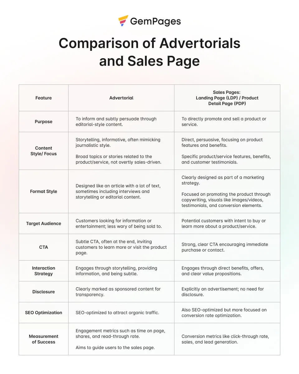
"Advertorial" and "sales page" get used almost interchangeably in creative briefs, and that's the root of a lot of underperforming funnels. They're not two names for the same page. They’re built for different jobs and readers in different states of mind. Their presentation can also affect disclosure obligations under applicable laws and advertising-platform policies. Pick wrong and you don't just lose a few points of conversion rate; you can spend a media budget building belief that the next page throws away.
Quick answer: A sales page is a standalone page built to close a sale — it assumes the visitor already wants the product and needs the proof, pricing, and a reason to act now. An advertorial is a long-form, editorial-style page that argues for a problem and a mechanism before the product appears, built for readers who aren't sold yet. Because it can resemble editorial content, an advertorial may need a clear disclosure depending on how it is presented and which rules apply.
What Is a Sales Page?
A sales page is a single, standalone page with one job: convince the person already reading it to buy. It doesn't pretend to be anything else. From the first section, the visitor knows they're looking at an offer — the only open question is whether it's worth saying yes to.
Worth clearing up early: a sales page and an advertorial are both, technically, landing pages — standalone pages with no site navigation, built around a single action. "Landing page" is the umbrella term; sales page and advertorial are two different jobs a landing page can be built to do. If you've read guides comparing "landing page vs. sales page," they're describing the split between lead-capture pages (an email address in exchange for something free) and this kind of page (money in exchange for a product). Advertorial sits one level deeper, as a specific style of pre-sell page most of those guides don't mention at all.
What's usually on it
- A headline built around the outcome, not the product name — what changes for the reader, not what the thing is called.
- Problem framing — a short section naming what the reader's current situation is costing them, so the offer has something to solve.
- The offer and how it works — plain-language explanation of the mechanism, not just a features list.
- Proof — testimonials, before-and-afters, results, third-party validation. Specific claims, not vague reassurance.
- Objection handling — pricing logic, guarantee terms, an FAQ that answers the questions a skeptical buyer would actually ask.
- Urgency, when it's real — an actual deadline or limited quantity, not a countdown timer that resets for the next visitor.
- One CTA, repeated — the same action, restated at every natural stopping point, with nothing competing for the click.
Long-form vs. short-form
Short-form earns its place with a warm audience, a familiar category, or a low price — the reader doesn't need much convincing, so extra copy is just friction between them and the buy button. Long-form earns its length when the price is high, the category is unfamiliar, or the traffic arrived cold from an ad; there, the extra real estate is doing necessary work, not padding. Neither is "better" as a rule. The right length is set by how much doubt the page has to clear, not by a template default.
When it's the right page
Use a sales page when what's left to answer is about the offer itself — will this work for me, is it worth the price, what happens if it doesn't — rather than whether the underlying problem or approach is legitimate in the first place. That's usually warm traffic: retargeting, an email list, branded search, or an ad that already did the work of building belief in the category before the click.
What Is an Advertorial?
"Advertorial" blends "advertisement" and "editorial," a term publishers have used since the 1940s for paid pages styled to read like articles. The web version does the same job with a different toolkit: a long-form page written like a piece of content — a story, an explainer, an investigation — that makes a case for a problem and a mechanism before the product shows up at all. A sales page opens with the offer. An advertorial opens with an idea, and treats the product as the answer to an argument the reader has just been walked through, not as the reason the page exists.
That reversal isn't just a tone choice — it changes the order of the entire page. A sales page's information order runs roughly: offer → proof → objections → price. A well-built advertorial runs closer to: reframe → mechanism → what a real fix would need to do → the product, introduced as that fix → proof → and only then, at the very end, price and urgency. An advertorial that opens with a discount code has already given away the ending and lost most of the reason to be long-form in the first place.
There's a second difference, and it isn't stylistic — it's regulatory. A sales page is unmistakably commercial from the first pixel, so there's rarely any real question about what a reader is looking at. An advertorial is deliberately styled like content, which is precisely the situation the U.S. Federal Trade Commission has spent the past decade writing guidance about. That's substantial enough to earn its own section below — but it's the single biggest thing separating these two page types, and it's the one almost no "advertorial vs. X" article mentions.
Advertorial vs. Sales Page: Side-by-Side
| Feature | Sales Page | Advertorial |
|---|---|---|
| Primary job | Close a sale the visitor is already considering | Build belief in a problem and mechanism before pitching |
| Built for | Warm-to-hot traffic — retargeting, email, branded search, referrals | Cold traffic — unaware or problem-aware readers |
| Opening move | States the offer and promise up front | Withholds the product; opens with a story, question, or reframe |
| Information order | Offer → proof → objections → price | Reframe → mechanism → criteria → product → proof → offer |
| Typical length | Roughly 500–5,000+ words, set by price and complexity | Usually long-form; set by how much belief the ad still has to build |
| Disclosure requirement | A separate native-ad label may not be needed when the commercial nature is already clear; other rules may still apply | A clear, prominent disclosure may be needed when editorial styling could mislead readers; requirements depend on context and jurisdiction |
| Position in the funnel | The decision page — typically the last stop before checkout | A pre-sell / bridge page — typically one step before sales page |
| Breaks down when… | Traffic arrives cold and isn't sold on the category yet | Traffic is already warm and just wants the specifics |
A note on data: there's no independently verified, current benchmark comparing "advertorial" and "sales page" conversion rates as categories. Anything you see quoted as a flat percentage is either out of date, specific to one niche, or unsourced — treat it accordingly. What the peer-reviewed research does say is covered further down.
The Line Almost Nobody Writes About: Disclosure and Compliance
This is the part that separates a practitioner's understanding of "advertorial" from a copywriting-blog definition.
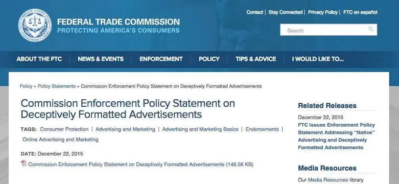
In the United States, the FTC's Enforcement Policy Statement on Deceptively Formatted Advertisements — and the accompanying Native Advertising: A Guide for Businesses — apply ordinary truth-in-advertising law to content styled like editorial. The standard the FTC uses is the "net impression" a page creates, not any single element examined in isolation: headline, layout, tone, and subject matter all get weighed together. The rule it boils down to is blunt: an advertisement shouldn't imply, through its format, that it's something other than an ad. Some commercial content is obviously commercial and needs no extra label. But the moment a page is styled closely enough to editorial content that a reasonable reader could mistake it for independent reporting, a clear and prominent disclosure becomes necessary — not as a footer courtesy, but placed near the headline, in language ordinary readers actually understand.
Not every label clears that bar. Based on the FTC's own guidance, terms like "Ad," "Advertisement," or "Sponsored Content" are understood by readers for what they are. Vaguer terms — "Promoted" on its own, for instance — are flagged as ambiguous, because readers may read them as a publisher's endorsement rather than a paid placement. The disclosure also has to travel with the ad: if the article gets shared, syndicated, or surfaced through a content-recommendation widget, the label needs to still be there, not just on the original placement.
There's a companion piece worth knowing about: the FTC's Endorsement Guides, which require that testimonials and expert endorsements reflect a real person's honest opinion. This is where "don't fabricate proof" stops being a style note and becomes a compliance question. An advertorial that invents a testimonial, dresses up a stock photo as a "real customer," or attributes an unverified quote to an "expert" isn't just weak copywriting — it's the specific pattern regulators and ad platforms watch for. Meta's ad standards and its policy on misleading claims apply to the destination page as much as the ad creative; a compliant ad pointing at a non-compliant advertorial is still a problem for the account behind it.
A conventional sales page is often clearly commercial, but its presentation and claims still matter. The page label alone does not determine whether disclosure or other advertising rules apply. That's the practical takeaway for anyone commissioning either page type: budget for a real, visible disclosure label in the advertorial's design from the start, and don't let the "proof" section outrun what you can actually substantiate. Both are cheaper to build in from day one than to fix after an ad account gets flagged.
Stop starting from zero. Get instant access to 600+ ready-to-customize HTML advertorials covering multiple niches, angles, and funnel structures—designed to give you a structured starting point instead of another blank page.
Where Each One Fits: Matching the Page to What's in the Reader's Head
Choosing between the two isn't really a design decision — it's a question of how much the reader already believes. The clearest framework for this still traces back to copywriter Eugene Schwartz's Breakthrough Advertising (1966), which named five stages of market awareness: unaware (doesn't know they have a problem), problem-aware (knows the problem, not that solutions exist), solution-aware (knows solutions exist, not your product), product-aware (knows your product, isn't sold), and most-aware (ready to buy, wants the offer).
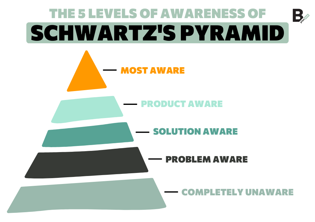
Readers at the unaware or problem-aware end need the reframe and mechanism an advertorial provides before a pitch will land at all. Drop a sales page in front of them and the page skips the part where they get convinced the problem — or this category of solution — is legitimate; the ad's click-through can look perfectly healthy while add-to-cart quietly stalls, because the visitor never accepted the premise the sales page assumes they already hold.
Readers who are solution-aware, product-aware, or most-aware have already done that work, often because a previous touchpoint (a prior ad, a review, a referral) did it for them. In front of that audience, a long editorial open reads as stalling — they came in ready to evaluate specifics, and every paragraph between them and the price is friction they didn't ask for. That's a sales or product page's job, not an advertorial's.
There's a legitimate middle option, too: a product page with a short editorial-style block above the fold — a compact story or mechanism explainer — before it moves into standard specs and offer. That fits an audience the ad partially convinced but didn't fully close, common enough in practice to be worth naming as its own option rather than forcing a binary choice.
As a hypothetical to make this concrete: picture an ad for a sleep aid that opens with "your insomnia probably isn't about stress" — a reframe most readers haven't heard. That ad has done unaware-to-problem-aware work and needs an advertorial to keep building the case for the actual mechanism before any product appears. The same brand retargeting people who already added the product to a cart and abandoned it needs the opposite: a short, direct page that clears the last objection — price, shipping, guarantee — as fast as possible. Same brand, same product, two different reader states, two different pages.
What the Research Actually Shows (and Doesn't)
Marketing content on native advertising leans hard on one 2013 industry study (Sharethrough and IPG Media Lab) claiming native ads draw more visual attention than banner ads. It's real, but it's over a decade old, industry-funded, and rarely linked back to its original numbers by the blog posts that cite it — which is a fair description of most stats that circulate in this space.
More recent, peer-reviewed research paints a more complicated picture, and it's worth citing because it's more useful than the recycled stat. A 2021 eye-tracking study published in Electronic Commerce Research found that native-style ads on Facebook held viewers' attention longer than banner ads — more total fixation time and longer average viewing — and that the extra attention was associated with stronger brand recognition. That's consistent with the general case for native and advertorial formats.
But a 2025 study in Frontiers in Psychology, also using eye-tracking, found close to the opposite pattern in Instagram feeds specifically: sponsored posts got less dwell time and fewer fixations than organic posts in the same feed, suggesting many users have learned to visually skip past native-style formatting the same way they learned to ignore banner ads a decade earlier — a kind of native-ad blindness developing as the format matures.
Read together, the honest conclusion isn't "native beats banner" or the reverse — it's that attention to native and editorial-style formats depends heavily on platform, audience familiarity with the format, and how well the specific piece is executed. That's a less quotable takeaway than a single percentage, but it's the one the current evidence actually supports. Anyone quoting you a fixed, universal number for how much better an advertorial performs than a sales page is citing something that isn't in the current research.
A Practical Decision Framework
Run the page through these five questions before a single word gets written.
- What did the ad already convince them of? If it introduced a cause, mechanism, or reframe the reader didn't already believe, the page has to keep making that case. That's advertorial territory.
- How cold is the traffic, really? First-touch traffic from an unfamiliar hook needs more runway than a retargeting audience who's already clicked once and knows the brand.
- Would a stranger mistake this for an article? If yes, you're in disclosure territory regardless of what the page is called internally — build the label in now, not after launch.
- Can everything on the page survive asking "prove it"? If the proof section only looks complete with invented testimonials or unverifiable claims, that's a sign the offer or the ad needs work — not a reason to stretch the truth on the page.
- What's the very next click? A sales page's next click is checkout. An advertorial's next click is usually a scroll to the offer, or a handoff to a separate sales or product page. Decide which one you're building before you write the headline.
Common Mistakes When Teams Pick the Wrong One
- Sending cold traffic to a short sales page. The page opens with price and a buy button, answering a question the reader hasn't asked yet.
- Building a full advertorial for a warm, retargeted audience. They already trust the brand; the story open reads as stalling, and warm traffic bounces before the mechanism section loads.
- Treating "advertorial" as a visual costume. News-style fonts and a fake headline without the disclosure that's supposed to come with that styling is the version that gets ad accounts and domains flagged — not the honest kind.
- Filling the proof section with invented or exaggerated testimonials because the real case studies aren't dramatic enough. That's a compliance problem before it's an ethics one.
- Reusing one advertorial across every ad angle. The story open only works when it matches the specific hook that earned the click. A generic opener breaks the connection to the ad, and the reader bounces before the argument even starts.
How the Two Work Together
For higher-ticket or genuinely unfamiliar offers, the practical answer usually isn't "advertorial or sales page" — it's both, in sequence. The ad sends cold traffic to the advertorial, which does the belief-building work; the advertorial's own call-to-action then hands off to a dedicated sales or product page that handles the transaction itself — pricing tiers, guarantee terms, checkout. Each page does one job well instead of trying to open cold and close the sale in the same scroll.
The handoff is the part worth designing on purpose. The sales page has to pick up the exact thread the advertorial just built — same vocabulary, same proof, same promise — not reset the reader's attention with an unrelated template. That continuity is less a copywriting task than a structural one, and it's usually where a purpose-built advertorial-to-sales-page pair earns the extra time it costs over stitching one together from a generic template. If that handoff is the part of the brief you're stuck on, it's worth having the two pages mapped and designed together rather than briefed separately.
The Bottom Line
A sales page and an advertorial aren't competing templates — they're built for two different moments in the same decision. Match the page to what the reader already believes when they click, not to whichever format is already open in the page builder, and disclose it honestly whenever the page is doing an advertorial's job. Getting that match right is most of what separates an ad account that scales from one that plateaus at a CTR that never turns into revenue.
Sources
- Federal Trade Commission, Native Advertising: A Guide for Businesses (Dec. 2015, updated 2021)
- Federal Trade Commission, FTC's Endorsement Guides: What People Are Asking
- Electronic Commerce Research (Springer, 2021), eye-tracking study on native vs. banner ad attention and brand recognition
- Frontiers in Psychology (2025), "Blending in or standing out? The disclosure dilemma of ad cues in social media native advertising"
- Eugene Schwartz, Breakthrough Advertising (1966) — origin of the five stages of market awareness referenced above