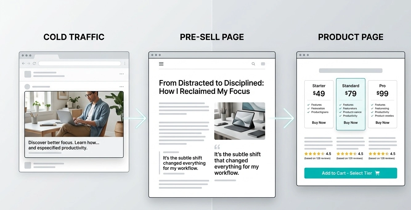
Presell Page Examples for Ecommerce: 6 Formats
A product page is not always the right first stop for a shopper who has just discovered your brand. If the product needs explanation, comparison, or a clearer reason to trust the offer, an ecommerce pre-sell page can provide that context before the visitor reaches the product page. It is not a guaranteed conversion lift; it is a funnel option worth testing against a direct path.
This guide presents six practical presell page examples for ecommerce. These are illustrative page structures—not claims about real brands, campaign results, or tested case studies. Adapt the format to the product and support every factual claim with evidence.
It answers a real shopper question, makes the product's relevance clear, uses truthful evidence, discloses commercial relationships where appropriate, and gives the visitor a clear next step to the product page.
What Is an Ecommerce Pre-Sell Page?
An ecommerce pre-sell page sits between a traffic source—such as a paid ad, creator post, or content recommendation—and a product page. Its job is to help visitors understand a problem, compare options, see a product in context, or decide whether the offer fits their needs.
A pre-sell page is not automatically an advertorial, and it does not need to imitate a newspaper or independent review. It may be a buying guide, product comparison, demonstration, listicle, or quiz. The format should be transparent about the commercial purpose and consistent with the message that brought the visitor there.
6 Ecommerce Pre-Sell Page Examples
Use the following examples as wireframes. Replace bracketed details with verified product information, original visuals, and evidence you can substantiate. Do not publish fictional testing, testimonials, prices, or performance results as if they were real.
1. Problem–Solution Story
Best for: products that solve a recognizable inconvenience and need context before their features make sense.
Illustrative headline: “A Simpler Way to Organize a Crowded Kitchen Drawer.”
Suggested structure: describe the everyday problem; explain why common approaches may be inconvenient; introduce the product category; show the product solving a specific task; then link to its details.
Make it credible: demonstrate the use case with original photos or video. If the story is fictional or illustrative, label it accordingly. Do not invent a first-person testing story or imply the writer personally used the product if they did not.
CTA: “See the product details.”
2. Product Comparison Page
Best for: shoppers deciding between product types, feature sets, or price tiers.
Illustrative headline: “Compact Blender vs. Full-Size Blender: Which Fits Your Routine?”
Suggested structure: explain the comparison criteria; compare relevant features, dimensions, maintenance, limitations, and total cost where known; identify who each option suits; and link to the relevant product pages.
Make it credible: use consistent criteria and sourced specifications. Disclose if the page is published by a seller or earns commission. Do not call a product “the winner” unless the evidence and criteria justify that conclusion.
CTA: “Compare specifications and availability.”
3. Listicle or Buying Checklist
Best for: products with several decision factors that readers can scan quickly.
Illustrative headline: “5 Things to Check Before Buying a Portable Monitor.”
Suggested structure: list the criteria that matter; explain each in plain language; show how the product meets—or does not meet—each criterion; finish with a product link for readers whose needs match.
Make it credible: the list should help someone make a decision even if they do not buy from you. Avoid arbitrary numbers, unsupported “best” claims, and fabricated expert endorsements.
CTA: “Check whether this model fits your setup.”
4. Demonstration-Led Pre-Sell Page
Best for: products whose value becomes clearer when people see them in use.
Illustrative headline: “See How This Foldable Stand Fits into a Small Workspace.”
Suggested structure: show the product in a realistic setting; demonstrate setup and core functions; identify relevant limitations; answer practical questions; and provide a link to specifications or purchase.
Make it credible: use genuine product imagery or footage and show the actual model being sold. Label mockups or illustrative images, and do not imply a demonstration proves performance beyond what it shows.
CTA: “View features and dimensions.”
5. Quiz or Product Finder
Best for: stores with meaningfully different options and shoppers who may need help narrowing the selection.
Illustrative opening: “Find the Right Desk Light for Your Workspace.”
Suggested structure: ask a small number of relevant questions; explain how answers affect the recommendation; show a product that matches the stated criteria; and let users review the reasoning before clicking through.
Make it credible: do not present a simple marketing quiz as a scientific diagnosis. Collect only necessary information, explain any data use, and ensure the recommendation logic actually reflects the answers.
CTA: “See your matching options.”
6. Educational Buying Guide
Best for: unfamiliar products or purchases where shoppers need to understand terminology and trade-offs.
Illustrative headline: “What to Know Before Choosing a Home Air Purifier.”
Suggested structure: define the main product categories; explain the specifications that matter; describe common trade-offs; provide a decision checklist; then link to a relevant product with its specifications and limitations.
Make it credible: cite reliable sources for technical or health-related claims, distinguish facts from recommendations, and avoid promising outcomes that the available evidence does not support.
CTA: “Review the product specifications.”
Compare the Formats: Which Should You Choose?
| Format | Use it when | What to measure | Main risk |
|---|---|---|---|
| Problem–solution story | The shopper needs context | Product-page clicks and purchases | Invented personal experience |
| Comparison | Options have meaningful trade-offs | Clicks by option and purchase rate | Biased or unsupported ranking |
| Listicle | Several criteria need explanation | Engagement and onward clicks | Thin, repetitive list items |
| Demonstration | Seeing the product clarifies its use | Video engagement and product clicks | Visuals that misrepresent the product |
| Quiz | Answers can meaningfully narrow choices | Completion and purchase rate | Irrelevant questions or opaque logic |
| Buying guide | Shoppers need education first | Qualified clicks and revenue per visitor | Overlong content without a decision path |
These are testing suggestions, not universal performance predictions. Choose one format based on the main uncertainty a shopper has, then compare it with a direct product-page path where practical.
What Every Ecommerce Pre-Sell Page Should Include
- A relevant headline: reflect the ad or referral message and the question the page answers.
- Useful context: explain the problem, category, or decision without delaying the answer with filler.
- Product-specific information: use accurate features, specifications, limitations, and original visuals where available.
- Evidence that can be checked: source factual claims and use genuine reviews only with appropriate context and disclosures.
- A clear commercial disclosure: make sponsorship, affiliate relationships, or seller involvement clear where applicable.
- A natural next step: tell visitors what they will find after clicking and ensure the destination matches the promise.
- A usable mobile experience: check readability, tap targets, loading behavior, image sizing, and whether the main action is easy to find.
Pre-Sell Page vs. Direct Product Page
A pre-sell page adds a step. That step is useful only if the extra explanation helps enough visitors to justify the additional friction. A direct product page may be the better route when visitors already know what they want or the product needs little explanation.
Test the complete journey, not just the pre-sell page's click-through rate. A page can send more visitors to the product page but still produce fewer purchases. Where possible, compare purchase conversion rate, revenue per visitor, and acquisition cost for equivalent audiences and traffic sources.
For a broader overview of page roles, see our guide to pre-sell pages and the advertorial landing page guide.
How to Test an Ecommerce Pre-Sell Page
- Define one question. For example, does a product demonstration help more than a text-led buying guide?
- Keep the comparison fair. Use the same offer, audience, traffic source, and measurement window as far as possible.
- Track the whole funnel. Measure visits, product-page clicks, add-to-cart events, purchases, revenue, and cost where available.
- Check tracking first. Confirm analytics events fire correctly on both the pre-sell page and the destination.
- Wait for enough data. A few impressions or purchases are not enough to establish a reliable winner.
- Record the result and limitation. Note what changed, the audience tested, and whether the evidence is conclusive or still directional.
For additional ideas on message and page structure, explore our guides to advertorial copywriting, conversion optimization, and the native ads funnel.
Frequently Asked Questions
Final Takeaway
The strongest ecommerce pre-sell page is not necessarily the longest or most persuasive-sounding. It is the one that answers a real buying question, represents the offer accurately, and helps the right visitor take a well-informed next step.
Start with one of these six formats, tailor it to your product and traffic source, and measure the entire path to purchase. Keep the version that produces better business outcomes—not merely more clicks.
Related Resources