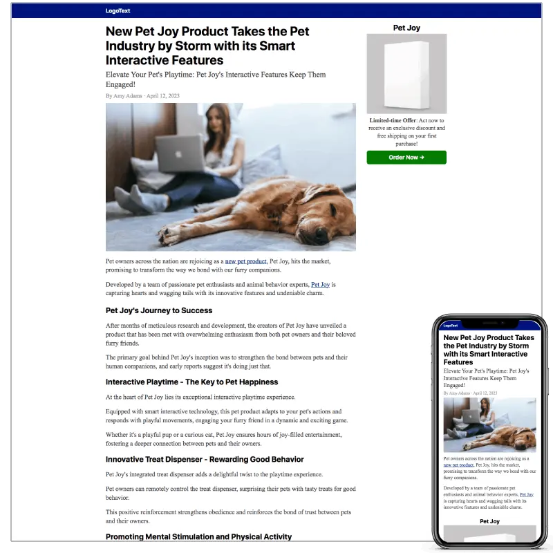
What Is an Advertorial Landing Page?
An advertorial landing page is a promotional web page written and designed in an editorial or article-like format.
The word advertorial combines advertisement and editorial.
Instead of immediately presenting a product, price, and "Buy Now" button, the page generally uses content such as:
- A headline
- An article-style introduction
- A problem or situation
- Educational information
- A story or discovery
- An explanation of a solution
- Evidence or supporting information
- A product or service recommendation
- A call to action
The goal is usually not to complete the transaction on the advertorial itself.
Its job is to move the reader from:
"I wasn't looking to buy anything."
to:
"This sounds relevant to me. I want to see the solution."
That is why advertorials are commonly used as pre-sell pages or pre-landers in performance marketing funnels.
The Native Advertising Institute similarly defines an advertorial as paid promotional content designed to look like editorial content while promoting a product, brand, or service.
What Is Advertorial Copywriting? →
Advertorial Landing Page vs Native Advertising
These terms are related, but they are not the same thing.
Native advertising is the advertising format and distribution environment.
For example:
Native ad → Publisher website → Click
The user might see a recommendation such as:
"This New Approach Is Changing How People Think About..."
They click the recommendation.
Advertorial landing page is the destination:
Native ad → Advertorial → Offer / Sales Page → Checkout
So:
- Native ad = traffic source / ad format
- Advertorial = destination content
- Sales page = conversion page
This distinction becomes extremely important when building a funnel.
Outbrain, for example, explicitly accepts advertorials as a landing-page type, provided they contain the required disclosure and comply with its policies.
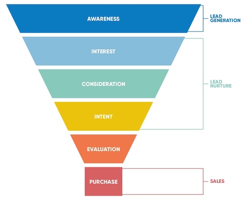
Why Use an Advertorial Landing Page?
The biggest reason is simple:
Cold traffic usually needs more context.
Someone searching Google for:
"Buy running shoes"
already has commercial intent.
Someone browsing an article on a publisher website didn't necessarily wake up intending to purchase anything.
They were consuming content.
That's a completely different psychological starting point.
An advertorial can therefore act as a bridge between attention and action.
Instead of:
Ad → Product
you create:
Ad → Story / Education → Solution → Offer
That extra step isn't automatically better. It depends on the audience, offer, traffic source, and funnel.
But when the visitor needs education or belief-building before the offer makes sense, the advertorial can be extremely useful.
Native Ads Funnel: From Ad Click to Conversion →
How an Advertorial Fits Into a Native Ads Funnel
A simple native advertising funnel can look like this:
Native Ad
   ↓
Advertorial
   ↓
Sales / Product Page
   ↓
Checkout / Lead Form
Each stage has a different job.
1. Native Ad
Job: Earn the click.
The ad needs to create enough curiosity or relevance for someone to leave the publisher's content.
2. Advertorial
Job: Build understanding and interest.
The visitor learns:
- What the problem is
- Why it matters
- Why common solutions may not be ideal
- What alternative exists
- Why the recommended solution deserves consideration
3. Sales Page
Job: Convert interest into action.
This is where the visitor can find:
- Product details
- Benefits
- Pricing
- Features
- Testimonials
- Guarantees
- Purchase options
4. Checkout
Job: Complete the transaction.
The advertorial therefore doesn't necessarily need to "close the sale."
It needs to earn the next step.
Advertorial vs Landing Page
The terms are often used interchangeably, but they describe different approaches.
| Advertorial | Traditional Landing Page | |
|---|---|---|
| Primary purpose | Educate + persuade | Convert |
| Typical format | Article / editorial | Offer page |
| Traffic | Often cold | Cold, warm, or hot |
| Main mechanism | Story + education | Benefits + offer |
| Product introduction | Usually later | Often immediately |
| CTA | Next step | Purchase / signup |
| Typical funnel position | Pre-sell | Conversion |
An advertorial is therefore not simply a "pretty landing page."
It is a different conversion mechanism.
This is a useful way to plan the funnel, but it is not a universal rule: some campaigns send visitors directly to a product or sales page when the offer is already clear and the audience is ready to act.
Advertorial vs Sales Page
This distinction is even more important.
A sales page essentially says:
Here's the product. Here's why you need it. Here's what it costs. Here's why you should buy it.
An advertorial says:
Here's a problem worth understanding. Here's what may be causing it. Here's what people commonly try. Here's another way of looking at it. Here's a solution worth exploring.
The sales page sells the offer.
The advertorial sells the idea of continuing.
That is why forcing an advertorial to behave like a sales page often makes the page feel unnatural.
When Should You Use an Advertorial?
An advertorial can make sense when:
- Your traffic is cold
The visitor doesn't know your brand or product. - Your product requires explanation
The customer needs to understand a mechanism, problem, category, or approach before evaluating the offer. - Your offer is unfamiliar
Education can make an unfamiliar solution easier to understand. - Your campaign is story-driven
Some products naturally lend themselves to discovery, comparison, review, or personal-story formats. - You are buying native traffic
Native placements frequently place your message beside editorial content. An article-style destination can create a more coherent transition from the ad into the page.
But don't assume an advertorial is always necessary.
Warm traffic, branded searches, returning visitors, and simple impulse offers may perform better with a direct conversion page.
The correct question isn't:
"Are advertorials better?"
It's:
"Does this visitor need education before the offer?"
The Anatomy of an Effective Advertorial Landing Page
There isn't one universal template.
But many effective advertorials share a recognizable structure.
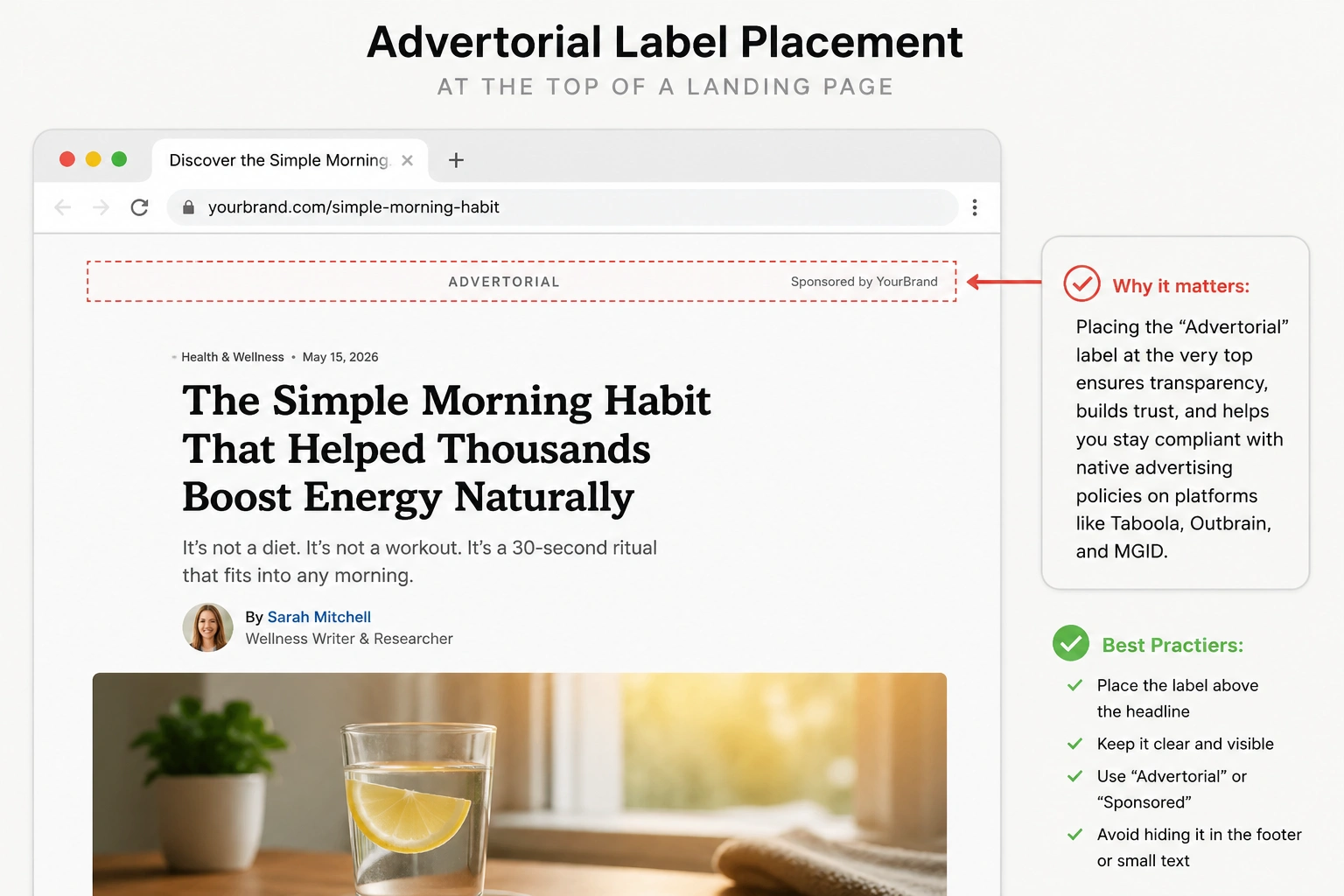
1. Clear Disclosure
The page should clearly communicate its commercial nature.
This is not something to hide.
For example:
Advertisement
or
Advertorial
or another clear disclosure appropriate to the campaign and jurisdiction.
Outbrain specifically requires prominent advertorial disclosure for applicable pages, while the FTC Native Advertising Guidance emphasizes that native advertising disclosures should be clear, prominent, and understandable.
Taboola's affiliate advertising guidance likewise states that advertisers should not create the false impression that users are viewing a news site or other non-promotional content, and calls for prominent "Advertorial" or equivalent disclosure.
FTC Native Advertising Guidance →
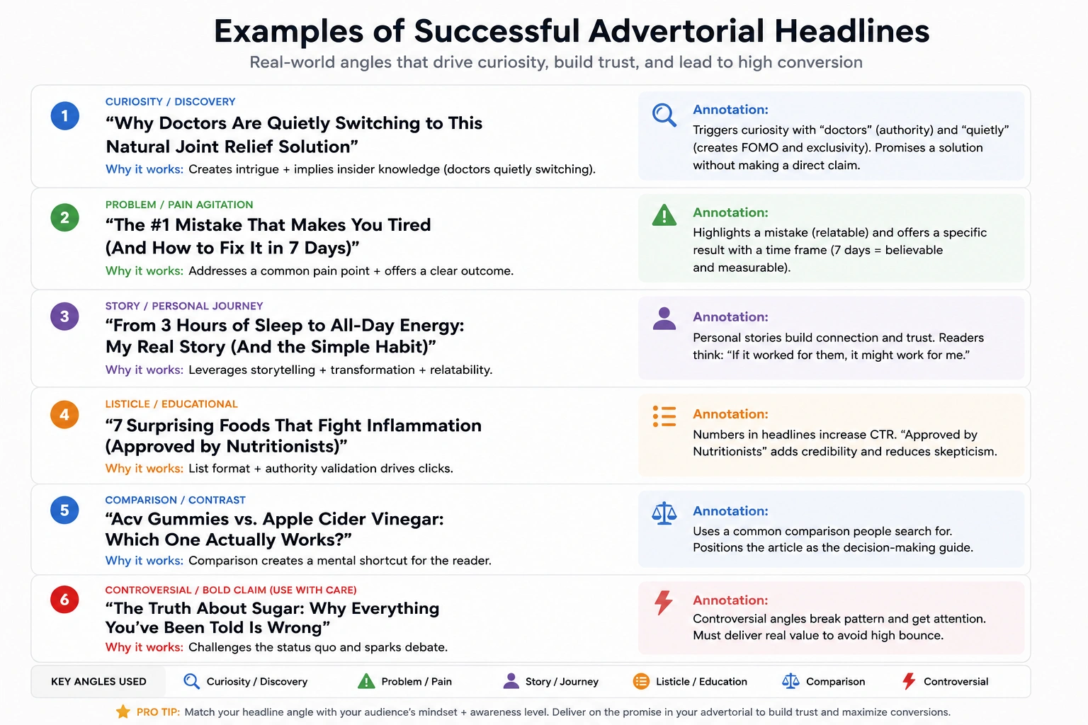
2. The Headline
The headline has one job:
Make the right person want to continue reading.
A strong advertorial headline doesn't necessarily scream:
BUY THIS PRODUCT!
Instead, it creates a relevant reason to investigate.
Examples of angles include:
- A surprising discovery
- A common mistake
- A comparison
- A problem
- A new approach
- A personal story
- A list
- A research angle
- A question
The critical rule:
The headline must accurately represent what the page delivers.
Don't create curiosity by promising something the article doesn't contain.
Outbrain specifically warns against misleading or exaggerated headlines that don't accurately represent the landing page.
3. The Opening
The first few paragraphs determine whether the visitor continues.
Avoid opening with:
"Welcome to our website."
Instead, immediately establish relevance.
A strong opening usually answers:
Why should I care?
The reader should quickly recognize:
- Their situation
- Their problem
- Their curiosity
- Their desired outcome
This is where good advertorial copywriting becomes critical.
4. The Problem
Now make the problem concrete.
Don't simply say:
"Weight loss is difficult."
Explain the specific situation.
For example:
- What people commonly experience
- Why existing approaches may disappoint
- What misconceptions exist
- What the reader may have overlooked
The goal isn't to manufacture fear.
It's to create understanding.
5. Failed Alternatives
This section can be powerful when handled honestly.
Instead of immediately saying:
"Our product is the only solution."
Explain why certain conventional approaches may not solve a particular problem.
For example:
Common approach
↓
Why it may fail in this situation
↓
What the reader actually needs
↓
Alternative mechanism
This creates a logical transition into the solution.
Avoid attacking competitors with unsupported claims.
6. The Unique Mechanism
This is one of the most important sections.
The mechanism explains:
Why might this solution work differently?
It could be:
- A technology
- A process
- A formulation
- A workflow
- A strategy
- A behavioral approach
- A product feature
The reader should understand the reasoning, not merely receive another marketing claim.
7. Introduce the Solution
Now introduce the product, service, or offer.
The transition should feel logical.
Bad:
"Anyway, here's our product. BUY NOW."
Better:
"This is where [solution] becomes relevant."
The product should answer the problem established earlier.
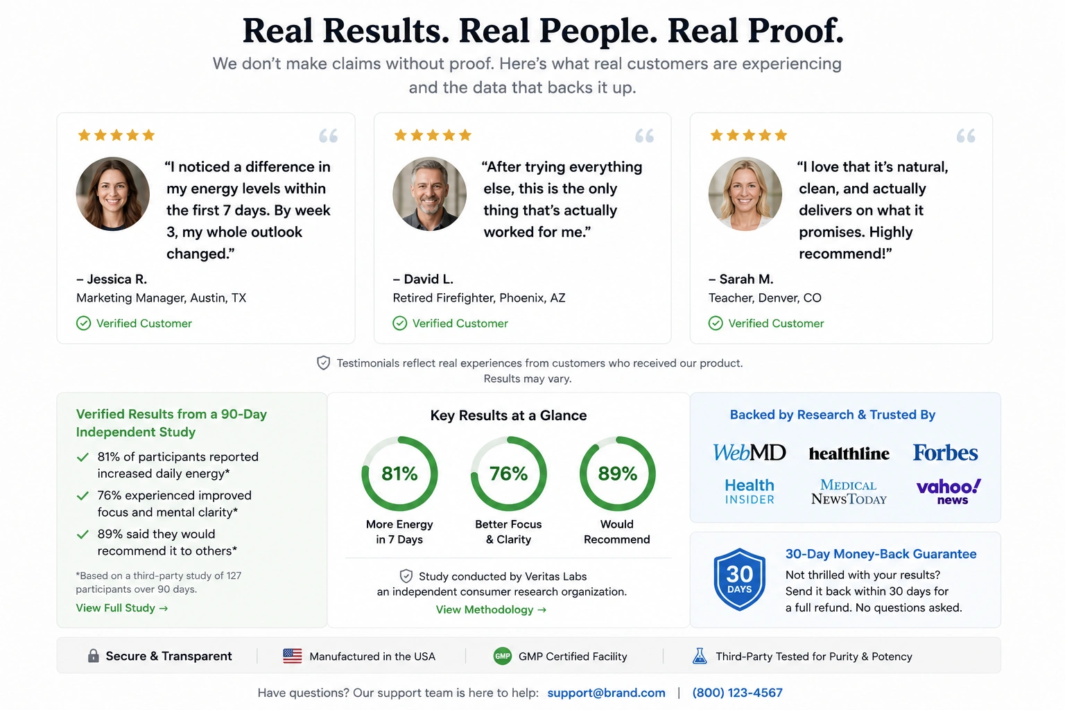
8. Proof
Proof can include:
- Demonstrable data
- Real customer experiences
- Expert commentary
- Product demonstrations
- Research
- Screenshots
- Case studies
- Transparent comparisons
But proof must be genuine.
Never manufacture testimonials, fake comments, fake experts, fake publications, or fictional results and present them as real.
Outbrain explicitly prohibits misleading techniques including fake testimonials, fake comments, and unsupported claims.
9. CTA
The advertorial CTA should make the next step obvious.
Depending on the funnel, that might be:
- Read the full product details
- Check availability
- See the offer
- Compare options
- Learn more
- Start a trial
- Request a quote
The CTA should match the visitor's stage.
You don't necessarily need:
BUY NOW!!!
repeated 14 times.
The 9-Part Advertorial Framework
Put everything together:
- Disclosure
- Curiosity-driven headline
- Relevant opening
- Problem
- Failed alternatives
- Unique mechanism
- Solution + proof
- Offer
- CTA
This is a framework—not a law.
Different campaigns may use different structures.
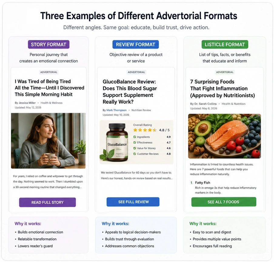
For example, common advertorial formats include:
- Personal story
- Product review
- Listicle
- Educational article
- Comparison
- Discovery story
- Case study
- Quiz
- Problem/solution article
These formats can be adapted to different campaign types, including ecommerce, lead generation, software, and other offers. The right format depends on the audience, the offer, the evidence available, and the promise made in the ad.
The Most Common Advertorial Formats
1. Story Advertorial
A narrative takes the reader from problem → discovery → solution.
Good for products with a strong origin story or transformation narrative.
2. Review Advertorial
The page examines a product or category.
It can work particularly well when the visitor wants to understand whether a solution is worth considering.
3. Listicle Advertorial
Examples:
"7 Things You Should Know Before Choosing..."
or:
"5 Alternatives to..."
The format naturally creates multiple curiosity points.
Listicle Lander vs Advertorial →
4. Educational Advertorial
The page teaches the visitor something first and introduces the commercial solution naturally.
This can be useful when the product requires explanation.
5. Comparison Advertorial
The page compares approaches, products, or strategies before introducing the recommended solution.
Advertorial Copywriting: Write Like a Reader, Not a Marketer
One of the biggest mistakes is writing an advertorial that sounds like a sales letter pretending to be an article.
The reader notices.
Instead, prioritize:
- Clarity: Every paragraph should be easy to understand.
- Specificity: Replace vague claims with concrete information.
- Relevance: Talk about the reader's actual problem.
- Momentum: Each section should create a reason to read the next.
- Credibility: Make claims that you can support.
- Transparency: Don't confuse editorial style with deception.
The best advertorial copy doesn't need to scream.
It creates a logical sequence:
Problem → Curiosity → Understanding → Belief → Solution → Action
How Long Should an Advertorial Landing Page Be?
There is no universal magic word count.
A better rule is:
Make the page as long as necessary to answer the reader's objections and create sufficient understanding—and no longer.
A simple product may need a relatively short page.
A complex health, finance, SaaS, or high-consideration offer may require considerably more explanation.
Don't add 5,000 words because someone told you:
"Google ranks long content."
Google doesn't reward length simply because it is long.
Your objective is complete useful coverage.
For this pillar page, however, comprehensive coverage makes sense because the search intent is broad.
Advertorial Examples: What Should You Study?
Don't simply collect screenshots.
Study the architecture.
When examining an advertorial, ask:
- What created the initial curiosity? Look at the headline and image.
- What happens immediately after the click? Does the page fulfill the promise made by the ad?
- How quickly is the problem established?
- When is the product introduced?
- What mechanism is explained?
- What proof is provided?
- Where are the CTAs?
- What objections are answered?
- What happens at the end?
A good swipe file teaches you why something works, not merely what it looks like.
When reviewing examples from different industries, compare the structure and evidence rather than copying claims or creative assets. A format that suits one audience or offer may not suit another.
Mobile Advertorial Optimization
Native advertising traffic can be heavily mobile.
That means your desktop version cannot simply be squeezed onto a phone.
Check:
- Font size
- Line length
- Image size
- Page speed
- CTA visibility
- Sticky elements
- Spacing
- Video behavior
- Navigation
- Disclosure visibility
The reader should never need to pinch, zoom, or fight the page.
Most importantly:
Read the entire page on an actual phone.
Not merely through a desktop browser resized to mobile.
Mobile Advertorial Optimization →
Advertorial Compliance: Don't Turn "Editorial Style" Into Deception
This deserves special attention.
An advertorial can resemble editorial content.
That does not mean you should make the visitor believe it is independent journalism when it is actually advertising.
The distinction is fundamental.
The FTC Native Advertising Guidance says native advertising disclosures should be clear and prominent, and consumers should be able to recognize the commercial nature of the content.
Outbrain requires prominent disclosure for advertorials and also requires functional navigation, privacy information, and appropriate contact information on landing pages. View Outbrain's landing page guidelines
Therefore, a professional advertorial should not depend on:
- Fake news branding
- Fake journalists
- Fake testimonials
- Fake comments
- Fake "as seen on" logos
- Misleading countdowns
- Fabricated studies
- Unsupported medical claims
- Hidden disclosures
Professional performance marketing is not about fooling the visitor.
It is about earning the visitor's attention and trust while remaining commercially transparent.
The Compliance Checklist
Before sending traffic to an advertorial, check:
- Disclosure: Is the commercial nature obvious? Is the disclosure visible near the top?
- Claims: Can every important claim be supported? Are testimonials genuine? Are results represented accurately?
- Navigation: Do all links work? Does the CTA lead where it says it will?
- Legal pages: Privacy Policy, Contact information, Required disclosures, Relevant terms.
- Health / Finance: Use the appropriate disclaimers and follow the specific requirements of the advertising platform and jurisdiction.
Outbrain's current guidelines specifically identify additional requirements for health and finance campaigns.
Outbrain Compliance Landing Pages →
How to Fix a Rejected Taboola Landing Page →
Common Advertorial Mistakes
Mistake #1: Making the page look fake
If the design is obviously pretending to be CNN, Forbes, BBC, or another publication, you're creating a credibility and compliance problem. Build an editorial-inspired design. Don't impersonate a publisher.
Mistake #2: Selling too early
If the first paragraph says: "Our revolutionary product is here!" you haven't earned the reader's attention. Start with the reader.
Mistake #3: Hiding the disclosure
Transparency isn't your enemy. A clear disclosure protects trust and helps meet platform requirements.
Mistake #4: Using fake proof
Never fabricate: Customers, Reviews, Experts, Results, Publications, Screenshots. If something is an example or hypothetical scenario, label it accordingly.
Mistake #5: Copying competitors
Study competitors. Don't copy them. Outbrain's guidelines explicitly prohibit copied content and misleading material.
Mistake #6: Optimizing only for CTR
A high click-through rate means very little if the resulting traffic doesn't convert. Look at the complete funnel: Ad CTR → Advertorial engagement → Offer click → Conversion → CPA / ROAS
Mistake #7: Creating one page for everyone
A supplement campaign and a B2B SaaS campaign shouldn't necessarily use the same story, structure, language, or proof. The best advertorial is built around: Audience + Offer + Traffic Source + Awareness Level.
How to Test an Advertorial
Don't randomly change everything. Test one major variable at a time when possible.
- Test the angle: Problem angle vs. Discovery angle
- Test the headline: Different curiosity mechanisms can attract very different audiences.
- Test the structure: Story (Problem → Discovery → Solution) vs. Listicle (5 Things → Explanation → Recommendation)
- Test the CTA: Learn More / See How It Works / Check Availability / View the Offer
- Test the offer transition: Does the product appear too early? Or too late?
Measure the complete funnel. Don't stop at page metrics. Track: Ad CTR, Engagement, Scroll depth, Outbound clicks, Conversion rate, CPA, Revenue, ROAS.
Do not treat a single campaign result as a benchmark for every offer. Compare the advertorial and the control page under comparable traffic conditions, and record the same measurement window for each version.
Track the full path: ad CTR → advertorial engagement → outbound click rate → conversion rate → cost per acquisition (CPA) and return on ad spend (ROAS). A higher scroll depth or click rate is not a win if qualified conversions fall or acquisition costs rise.
Before calling a test successful, document the traffic source, audience, offer, spend, conversion definition, sample size, and test dates. Report actual results only when those records are available.
What Makes a Great Advertorial Landing Page?
A great advertorial isn't simply: long + pretty + persuasive.
It has alignment.
The ad creates curiosity. ↓
The advertorial fulfills that curiosity. ↓
The article explains the problem. ↓
The mechanism makes sense. ↓
The proof reduces uncertainty. ↓
The offer becomes relevant. ↓
The CTA feels like the logical next step.
That is the real architecture.
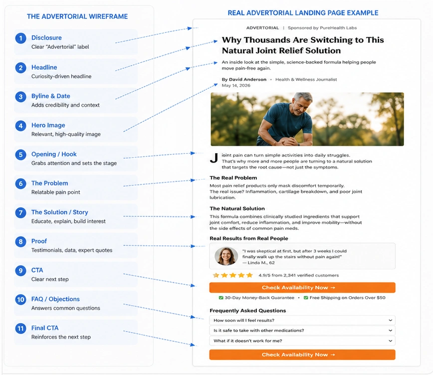
A Simple Advertorial Wireframe
Here's the entire concept in one view:
┌──────────────────────────────┐
│        ADVERTISEMENT         │
├──────────────────────────────┤
│                              │
│          HEADLINE            │
│                              │
│       Author / Date          │
│                              │
│        Hero Image            │
│                              │
├──────────────────────────────┤
│                              │
│      The Problem             │
│                              │
│      The Story               │
│                              │
│      Failed Alternatives     │
│                              │
│      New Discovery           │
│                              │
│      Unique Mechanism        │
│                              │
│      Evidence / Proof        │
│                              │
│      Product / Solution      │
│                              │
│      CTA                     │
│                              │
│      More Proof              │
│                              │
│      FAQ                     │
│                              │
│      Final CTA               │
│                              │
└──────────────────────────────┘
The exact design can change. The logic is what matters.
Advertorial Landing Page vs Pre-Sell Page
You'll often hear these terms used together. A pre-sell page is a page designed to prepare the visitor for an offer. An advertorial is one of the most common ways to build that pre-sell experience.
So you can think of it like this: Pre-sell = function, Advertorial = format / execution.
Not every pre-sell page is an advertorial. And not every advertorial must use exactly the same funnel.
Should You Build an Advertorial From Scratch or Use a Template?
Both approaches can work.
Templates: Useful when you need speed, a structural starting point, inspiration, multiple campaign variations, or a fast MVP. But a template shouldn't determine your strategy.
Custom Design: Better when you need A unique brand experience, A specific funnel, Custom storytelling, Custom UX, A particular traffic source, A differentiated campaign.
The best workflow is often: Strategy → Copy → Structure → Design → Development → Testing. Not: Template → Fill in text → Launch.
The Professional Advertorial Workflow
If you're building one for a real campaign, use this sequence:
- Understand the offer: What are you selling? Who is it for? Why would someone want it?
- Understand the traffic: Where does the visitor come from? Taboola? Outbrain? MGID? Search? Social? Different traffic sources create different expectations.
- Define the awareness level: Is the reader completely unaware, problem-aware, solution-aware, product-aware, or ready to buy? The colder the audience, the more context you may need.
- Choose the angle: Don't write an article before deciding: "What is the most compelling reason this person should keep reading?"
- Build the narrative: Create the sequence.
- Write the copy: Write for humans first. Then optimize for search where appropriate.
- Design the page: Make the design support the story.
- Add proof: Only real, relevant proof.
- Add compliance: Disclosure, policies, disclaimers, working links, and platform requirements.
- Test: Launch. Measure. Learn. Improve.
Imagine testing two versions of the same campaign: one introduces the product quickly, while the other explains the reader's problem and the reasoning behind the proposed solution first. Keep the offer, audience, and measurement window as consistent as possible so the comparison is meaningful.
This is an illustrative test plan, not a reported client result. Use your own campaign data to determine which version performs better; do not assume that a longer story or a later CTA will automatically improve conversions.
The Bottom Line
An advertorial landing page is not simply a blog post with a product link. And it isn't simply a sales page wearing a different design. It is a bridge.
A good advertorial takes a visitor who isn't necessarily ready to buy and gives them enough context to understand: the problem → the opportunity → the mechanism → the solution → the next step.
For native advertising, that distinction can be especially important because the visitor often arrives from a content environment rather than an explicitly commercial search. The strongest advertorials therefore don't rely on deception. They rely on relevance, curiosity, education, evidence, clarity, and a logical transition to the offer.
And when the page is built properly, every element has a job: The ad earns the click. The advertorial earns attention. The story builds understanding. The proof builds confidence. The offer creates action.