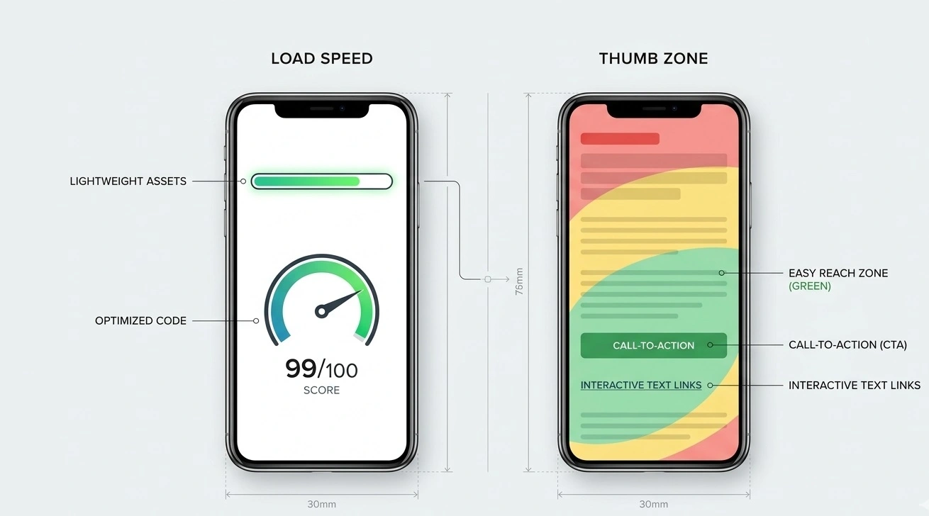
Mobile Advertorial Optimization: Speed, UX, and CRO
Mobile optimization is not a magic conversion trick. It is the work of removing friction between the click on a native ad and the next useful action on the page. If the headline is hard to read, the first screen is slow to appear, or the CTA is difficult to tap, visitors may never reach the substance of your advertorial.
This guide focuses on the parts you can inspect and improve: loading performance, readable layouts, image delivery, content structure, CTA usability, and a testing process. Use your own traffic data to decide which issue deserves attention first.
1. Measure mobile performance before changing the page
Do not begin by deleting scripts or compressing every image at random. First establish a baseline. Test the same URL under comparable conditions, record the result, and identify which resource or interaction is causing the problem.
Google's Core Web Vitals provide three useful signals:
| Metric | What it tells you | Good target |
|---|---|---|
| LCP | How quickly the main visible content loads. | 2.5 seconds or less |
| INP | How responsive the page feels when a visitor interacts. | 200 milliseconds or less |
| CLS | How much visible content shifts unexpectedly. | 0.1 or less |
These are Google's “good” Core Web Vitals thresholds when evaluated at the 75th percentile of page visits. They are not promises about conversion rates, and they do not mean every advertorial must hit an arbitrary 1.5-second load target.
Start with PageSpeed Insights for lab diagnostics and, when available, field data. If field data is unavailable because a page has too little traffic, use lab tests as directional evidence rather than treating one run as a definitive verdict. See Google's guidance on Largest Contentful Paint and Core Web Vitals.
2. Improve the first screen and LCP
For many advertorials, the largest visible element is the hero image or a large headline block. If that element is delayed, the page can feel unfinished even if the rest of the HTML has arrived.
Inspect these likely causes
- Oversized hero images: serve an image close to its actual display size instead of forcing a phone to download a huge desktop asset.
- Render-blocking resources: review stylesheets, scripts, and font requests that delay the first meaningful render.
- Slow server response: inspect TTFB and hosting behavior before assuming the image is the only problem.
- Unstable layout: reserve image dimensions so text and buttons do not jump when media loads.
Practical sequence: identify the LCP element in the report, inspect its file size and loading priority, optimize that specific resource, and retest. A hero image does not have to be under 100 KB in every case; the right size depends on its dimensions, visual quality, format, and delivery conditions.
If the hero image is the LCP element, avoid lazy-loading it by default. Lazy loading is generally more suitable for images below the initial viewport. Consider responsive images with srcset and sizes, modern formats such as WebP or AVIF where supported, and explicit width and height attributes.
3. Reduce unnecessary page weight without breaking measurement
A lean HTML/CSS page can be a sensible choice for a focused advertorial, but “HTML only” is not a universal rule. Analytics, consent tools, attribution, and conversion tracking may be necessary for a campaign. Remove what is redundant, not what you need to measure outcomes.
- Remove unused libraries, duplicate tags, and widgets that add no clear value.
- Load non-critical JavaScript with appropriate deferred or asynchronous behavior where compatible.
- Use system fonts when they meet the design needs, or optimize web fonts and avoid loading unused weights.
- Compress images and deliver suitable dimensions for mobile screens.
- Keep third-party embeds out of the initial viewport when they are not essential.
- Retest analytics, consent behavior, outbound links, and conversion events after each technical change.
Do not promise a PageSpeed score such as 90+ without testing the actual page. Scores vary with code, assets, server response, third-party tools, and test conditions.
4. Make the page comfortable to read on a phone
A mobile-first layout should let visitors read the story and understand the offer without pinching, hunting for controls, or fighting the page. The following are useful starting points, not rigid laws:
- Body text: start around 16–18 CSS pixels and check readability on common screen sizes.
- Line height: use enough vertical space to distinguish lines; around 1.5–1.8 is a reasonable starting range for body copy.
- Contrast: ensure text and controls remain distinguishable in normal viewing conditions.
- Paragraphs: break up long passages where a new idea begins, not just to enforce a fixed sentence count.
- Images: use relevant visuals that explain the story or offer, not decorative assets that delay the content.
- Layout: prevent horizontal scrolling and avoid overlays that hide the headline, text, or CTA.
The viewport declaration should be present in the document head:
<meta name="viewport" content="width=device-width, initial-scale=1.0">
Also test with browser zoom and larger text settings where possible. A layout that works only at one exact font size is fragile.
5. Match the opening to the ad that earned the click
Mobile visitors should not have to scroll through a long introduction to discover why they landed on the page. The first screen should acknowledge the specific topic or question implied by the ad and begin delivering the promised information.
| Problem | Better approach |
|---|---|
| The ad promises a comparison, but the page starts with a generic brand story. | Show the comparison criteria early and explain how the options will be evaluated. |
| The headline makes a strong claim that the page cannot support. | Use a narrower, evidence-based headline and explain the limits of the information. |
| The opening repeats the headline without adding anything. | Use the first paragraph to answer the obvious follow-up question or establish useful context. |
| The offer appears before the page has explained its relevance. | Explain the problem, relevant evidence, and why the offer may fit before asking for action. |
Curiosity is useful only when the page fulfils it. Do not invent first-person testing, medical outcomes, savings, expert endorsements, or product comparisons to make a hook sound more specific.
6. Place CTAs where they make sense—not at a fixed percentage
There is no universal rule that the first CTA belongs at 60–70% of every advertorial. A short comparison, a detailed explainer, and a video-led page have different reading patterns. Put the next action close to the point where the reader has enough information to understand it.
- Contextual link: place it beside the relevant explanation when readers may reasonably want to explore the offer.
- Primary CTA: make the next step clear after the page has explained what is offered and who it is for.
- Tap target: give buttons enough size and spacing to avoid accidental taps; around 44 CSS pixels in height is a useful design starting point.
- Destination: ensure the CTA opens the expected page and that the offer, price, and claims remain consistent.
Test CTA wording or placement with a clear hypothesis and a defined primary metric. Keep other meaningful variables stable where possible. A change in clicks is not automatically a win if purchases, qualified leads, or contribution margin get worse.
7. Be careful with sticky buttons, pop-ups, and ad policies
Sticky CTAs and pop-ups can cover content or interrupt reading, especially on narrow screens. They are not automatically prohibited in every implementation, nor can a generic article guarantee approval by an ad network.
Review the current rules for the platform and campaign before launch, including the policies for Taboola landing pages and Outbrain advertising. Make commercial intent and sponsorship clear where required. Do not disguise an advertorial as independent journalism, and substantiate claims about health, money, or performance.
If you test a sticky element, verify that it does not obscure important content or controls, can be dismissed where appropriate, works with keyboard and assistive technology, and meets the relevant platform requirements.
8. A practical mobile advertorial QA checklist
Before launching or changing a page, work through this checklist on a real phone as well as in performance tools.
Performance
- [ ] Record a baseline in PageSpeed Insights or another repeatable test.
- [ ] Inspect the LCP element and address its actual bottleneck.
- [ ] Resize and compress images; use responsive image delivery where useful.
- [ ] Remove unnecessary scripts without breaking attribution or conversion tracking.
- [ ] Check layout shifts, server response, and interaction responsiveness.
Reading and interaction
- [ ] The headline and opening deliver on the ad's promise.
- [ ] Text is readable without forced zooming or horizontal scrolling.
- [ ] Buttons and links are easy to tap and do not overlap.
- [ ] CTAs lead to the intended destination and work on mobile.
- [ ] Pop-ups and sticky elements do not obstruct the content.
Trust and measurement
- [ ] Claims are supportable and testimonials or personal experiences are genuine.
- [ ] The advertorial's commercial nature is disclosed where required.
- [ ] Network policies have been checked for the current campaign.
- [ ] Analytics and conversion events still work after technical changes.
- [ ] Success is judged by a business outcome—not page speed or CTA clicks alone.
9. How to test improvements without guessing
Choose one bottleneck, write down the expected effect, and define the measurement before changing the page. For example:
Observation: the hero image is the LCP element and takes a long time to load.
Change: serve a correctly sized, compressed image and preserve its display dimensions.
Technical measure: compare LCP and page weight under comparable test conditions.
Business measure: compare qualified offer clicks, purchases or leads, and CPA where enough data is available.
Decision: keep the change if it improves the intended outcome without damaging visual quality, tracking, or another important metric. Do not attribute a conversion change to the image alone if other variables changed at the same time.
When traffic is limited, avoid declaring a winner from a handful of conversions. Document what changed and gather more evidence before making a strong conclusion.
Need a mobile-ready advertorial?
If you want a starting point to customize, browse the advertorial template collection. If the campaign needs a page built around a specific offer, audience, and funnel, consider a custom build. Neither option guarantees a particular PageSpeed score, conversion rate, or ad-network approval; those depend on the implementation and campaign.
Use a template to begin with an existing structure, or request a custom page tailored to your offer and mobile requirements.
FAQ: Mobile Advertorial Optimization
The Bottom Line
Mobile advertorial optimization starts with evidence, not a universal “three-second rule” or an arbitrary file-size target. Measure the page, improve the bottleneck that matters, make the story readable, and keep the next action clear.
Then evaluate both technical performance and the outcome that matters to the campaign. Faster loading can remove friction, but it does not replace a relevant offer, credible claims, or a useful page.
Build for the phone your audience uses—and validate the result instead of assuming it worked.
Related Resources: